Excel Humour 2022-01-10 Excel Chart Superhero
Sometimes it’s easy to make an Excel chart, and sometimes a struggle. There are days when you feel like a superhero, if you just manage to build a simple chart, and change the colours in it!
Here are a couple of short videos that show how to work with Excel pie charts, and win the battle.
You’re an Excel Chart Superhero
If you managed to change the colours in your Excel chart today – congratulations! You are a superhero!

How to Make a Pie Chart
A pie chart shows amounts as a percentage of the total amount. Other charts, such as a bar chart or a column chart, are better for showing the differences between amounts.
If you need a pie chart, create a simple one, without special effects such as 3-D. Then, format the data labels, so the data is easier to understand. Watch this short video to see the steps for making and formatting an Excel pie chart.
There are written steps on my Contextures website.
Add Pictures to a Pie Chart
It’s usually best to keep things simple, but in this example, pictures are added to the slices, to show types of pizza toppings.
Watch this video to see the steps for adding pictures in Excel pie chart slices, and there are written steps on my Contextures site.
More Excel Chart Tutorials
There are more Excel chart tutorials and videos on my Contextures site, and here are a few examples, with links to the instructions.
Gantt Charts
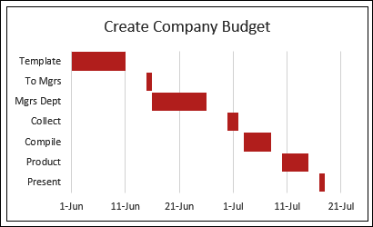
Although Excel doesn’t have a built in Gantt chart type, you can follow the steps below to create a simple project plan in Excel, with a Gantt chart timeline.
In the example shown below, I created a simple Gantt chart, to show the steps in working on a company budget. You can see when each step starts, and when it ends.
There are instructions on this page: Gantt Charts
Line Chart with Target Range
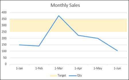
In a line chart with monthly sales data, you can add a shaded target range, behind the line. That will give you a quick indication of which months didn’t fall within the expected range.
Video: Line Chart Shows Target Range
In this video, I show all the steps for setting up this chart. Also, my Contextures site has written steps for making a line graph with target range.
Combination Charts
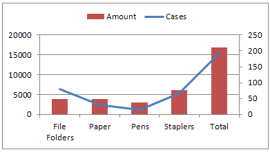
If you use two different chart types in a single chart, it’s called a combination chart, like the line-column chart shown below.
In this example, each series is on a different axis, so you can compare the amounts (thousands), with the number of cases (hundreds). If both were on the same axis, the cases would be almost impossible to see, because those numbers as so small.
Get the instructions on this page, on my Contextures site: Line-Column Chart 2 Axes
Cluster Stack Chart
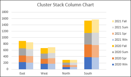
Or, get really fancy, and make a cluster stack chart, which is a combination of a stacked column chart, and a clustered column chart. In the example shown below, the chart has:
- a Cluster of columns for each region (East, West, North, South)
- a Stack in each column, with a different coloured segment for each season in the year
You’ll find written steps and a video on my Contextures site: Excel Cluster Stack Chart
In-Cell Charts
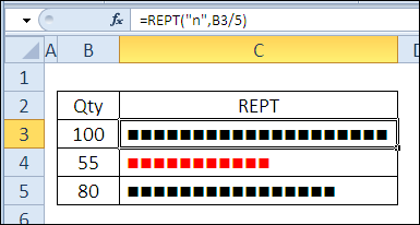
You can even make charts in worksheet cells, by using the Excel REPT function. In the example shown below, I used the Wingdings font to create the squares, and the bar length is based on the number in column B. To create the column, for quantities less than 60, I added conditional formatting.
Get the instructions on this page: Excel REPT Function Examples
_______________________________